
Brookes Publishing AEPS Website
Supervisors:
Courtney Glancy and Jagjeevan Virdee
Roles: UX Lead, Visual Design Lead
Insomniac Design, LLC
At Insomniac Design, we underwent a significant effort to rebrand and redevelop Brookes Publishing’s popular online child assessment tool; Assessment, Evaluation, and Programming System for Infants and Children.
As UX and Visual Design Lead of the accompanying marketing website and repository, I contributed heavily to user research and interviews, as well as creation in information architecture, wireframes, prototypes, and eventually high-fidelity web designs.
As UX and Visual Design Lead of the accompanying marketing website and repository, I contributed heavily to user research and interviews, as well as creation in information architecture, wireframes, prototypes, and eventually high-fidelity web designs.
The Challenge
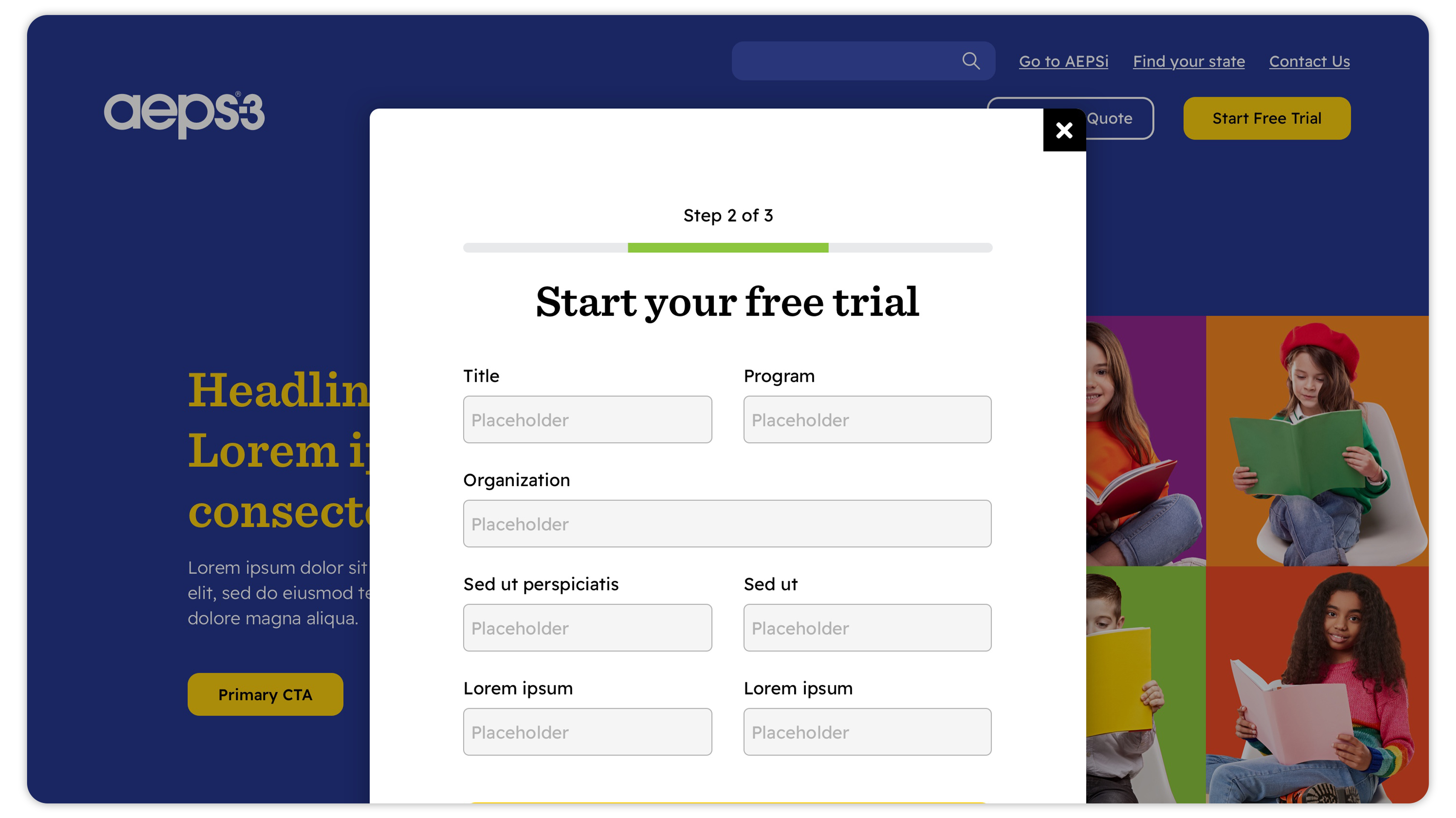
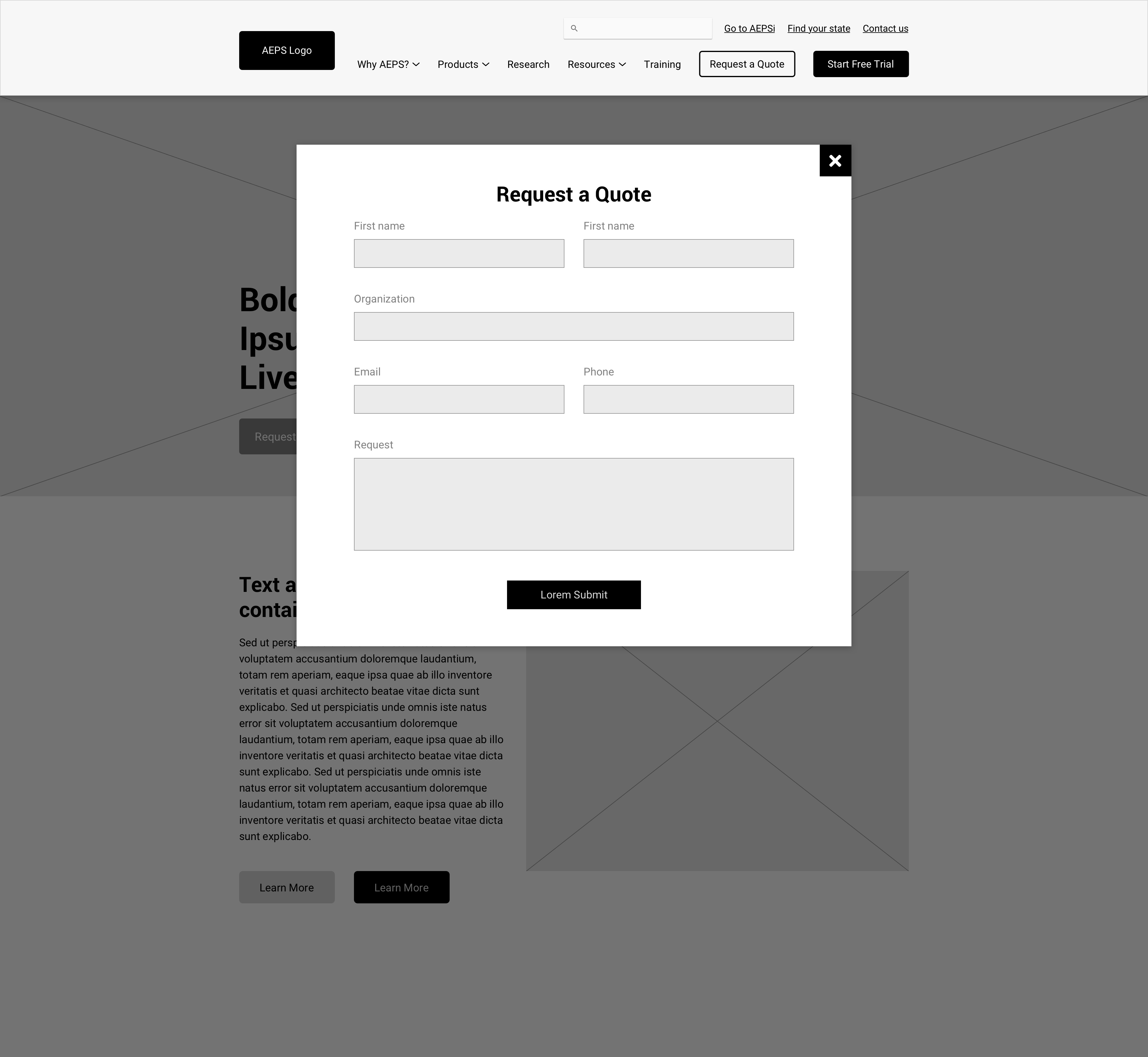
Our major hurdle was simply the overhaul needed to bring their website up to the modern standard. It wasn’t just a rebrand, but also a complete reorganization of the site navigation, and challenged to drive users to brand new content and features like their free trial and quote requester. Furthermore, we sought to identify and develop new ways to market AEPS benefits, nurture human touchpoints, and improve the integration of their marketing pipeline.
We would first set out to create a comprehensive, research-based understanding of the AEPS audience’s wants and needs for the site, and then use those findings as the blueprint for a new hub that brought them under one roof that served users and stakeholders across the board.
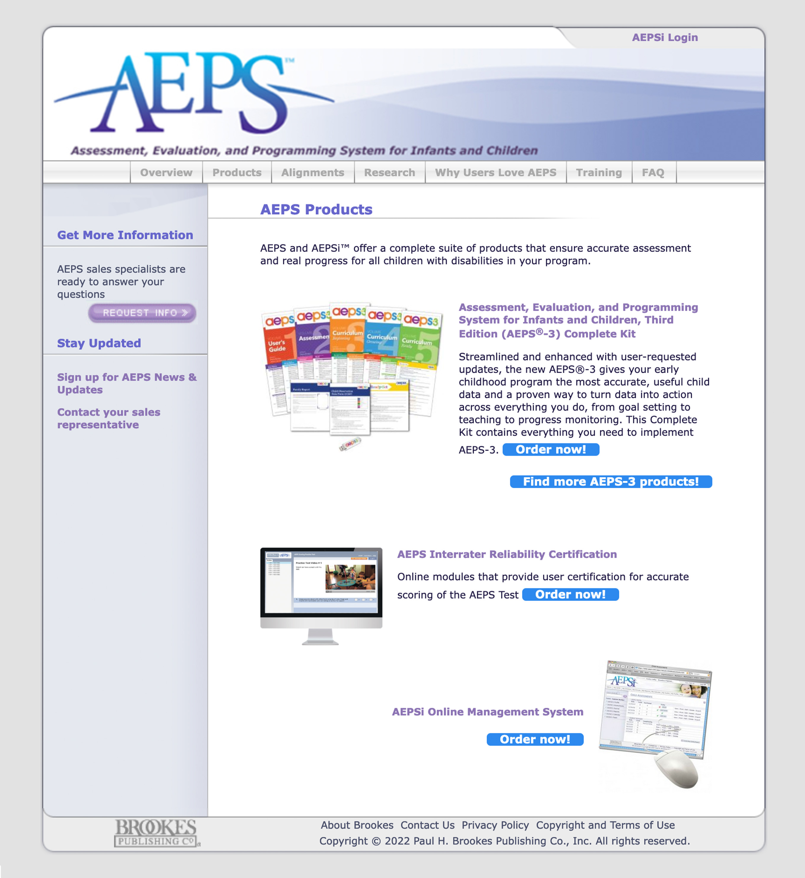 The old AEPS marketing site was plagued with dated visuals, confusing information architecture, and confusing or redundant messaging. It was clear from the outset that, to better serve users and stakeholders, it would be necessary to reorganize the website entirely from scratch.
Early Concepting
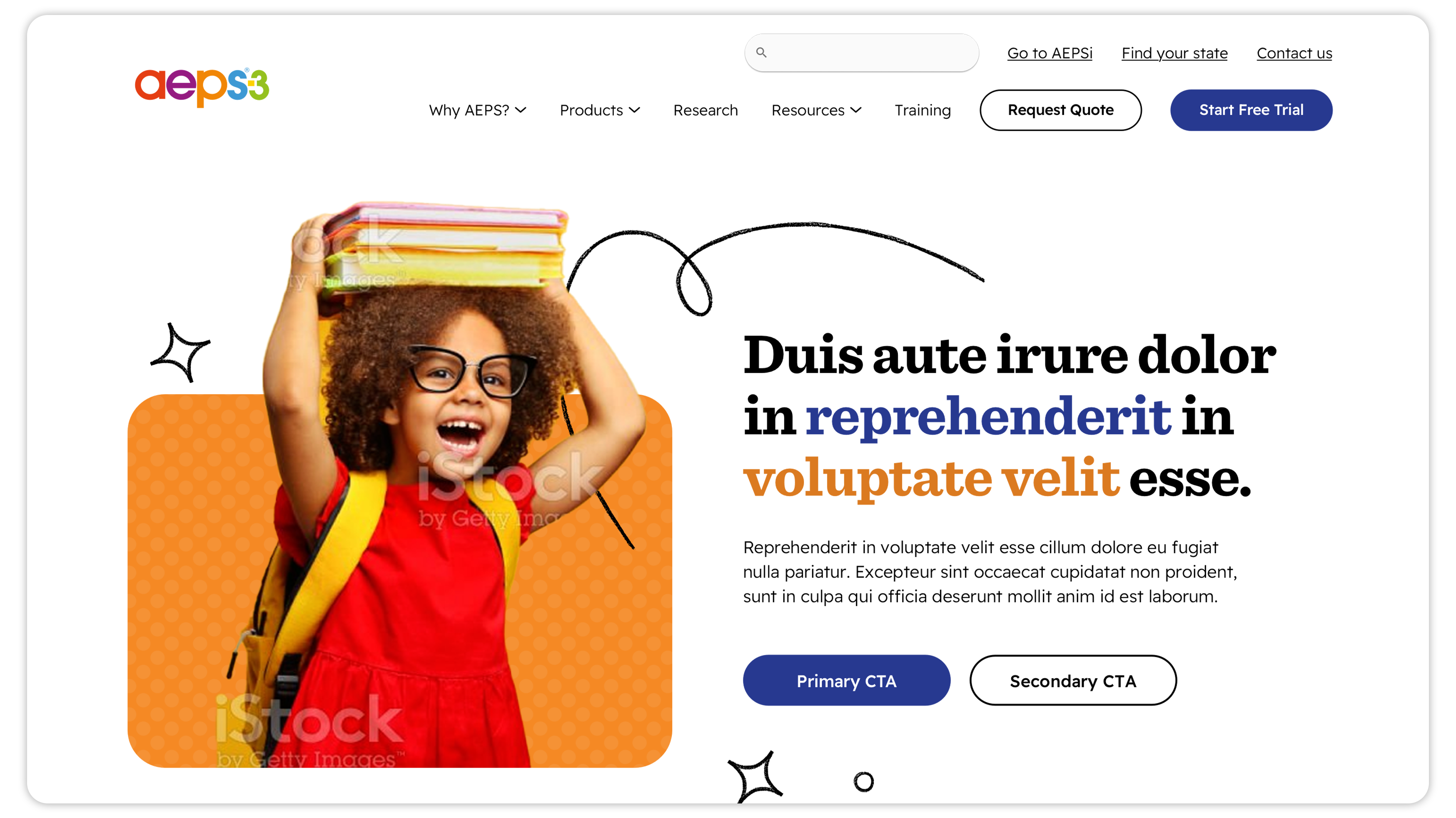
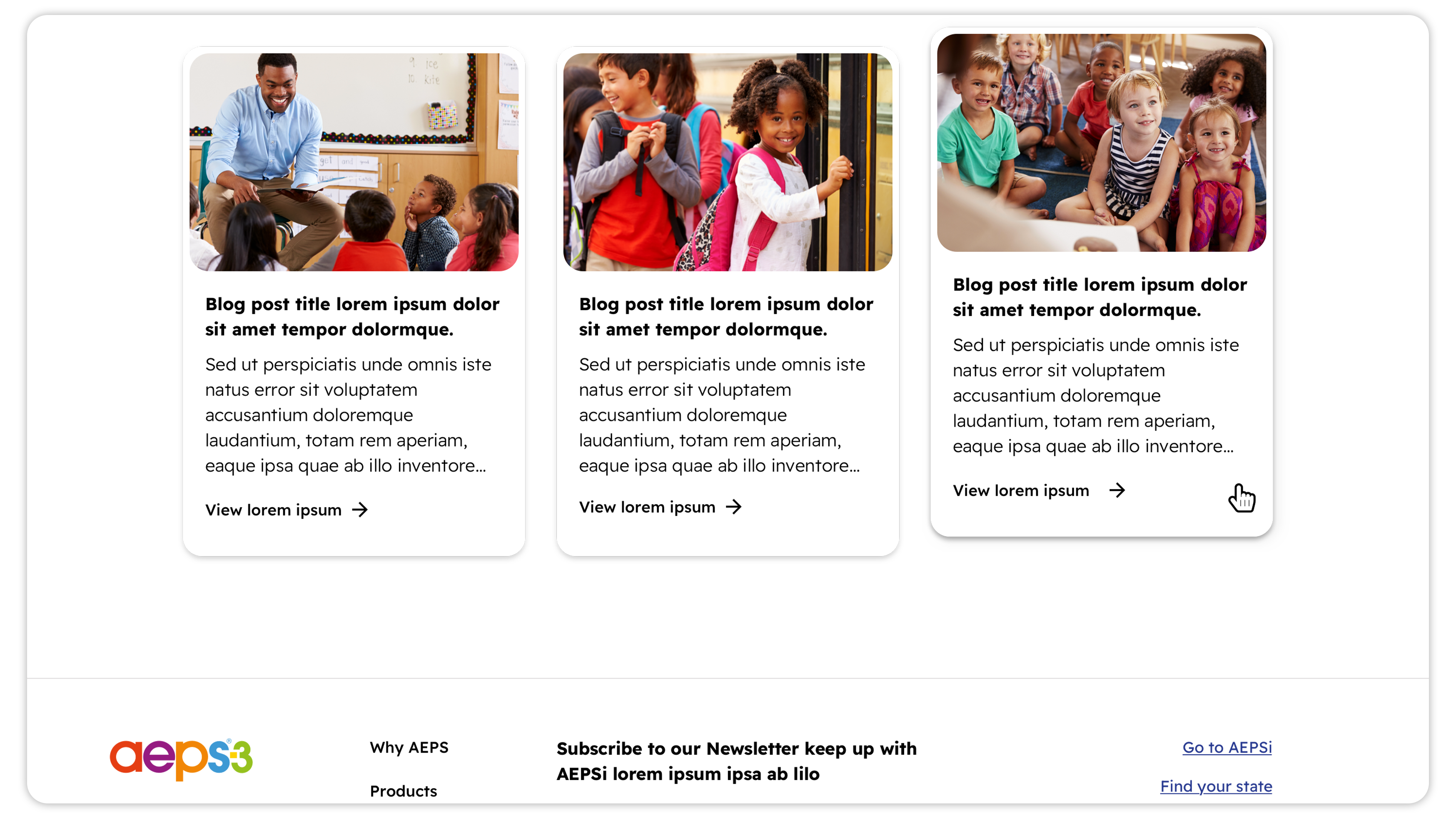
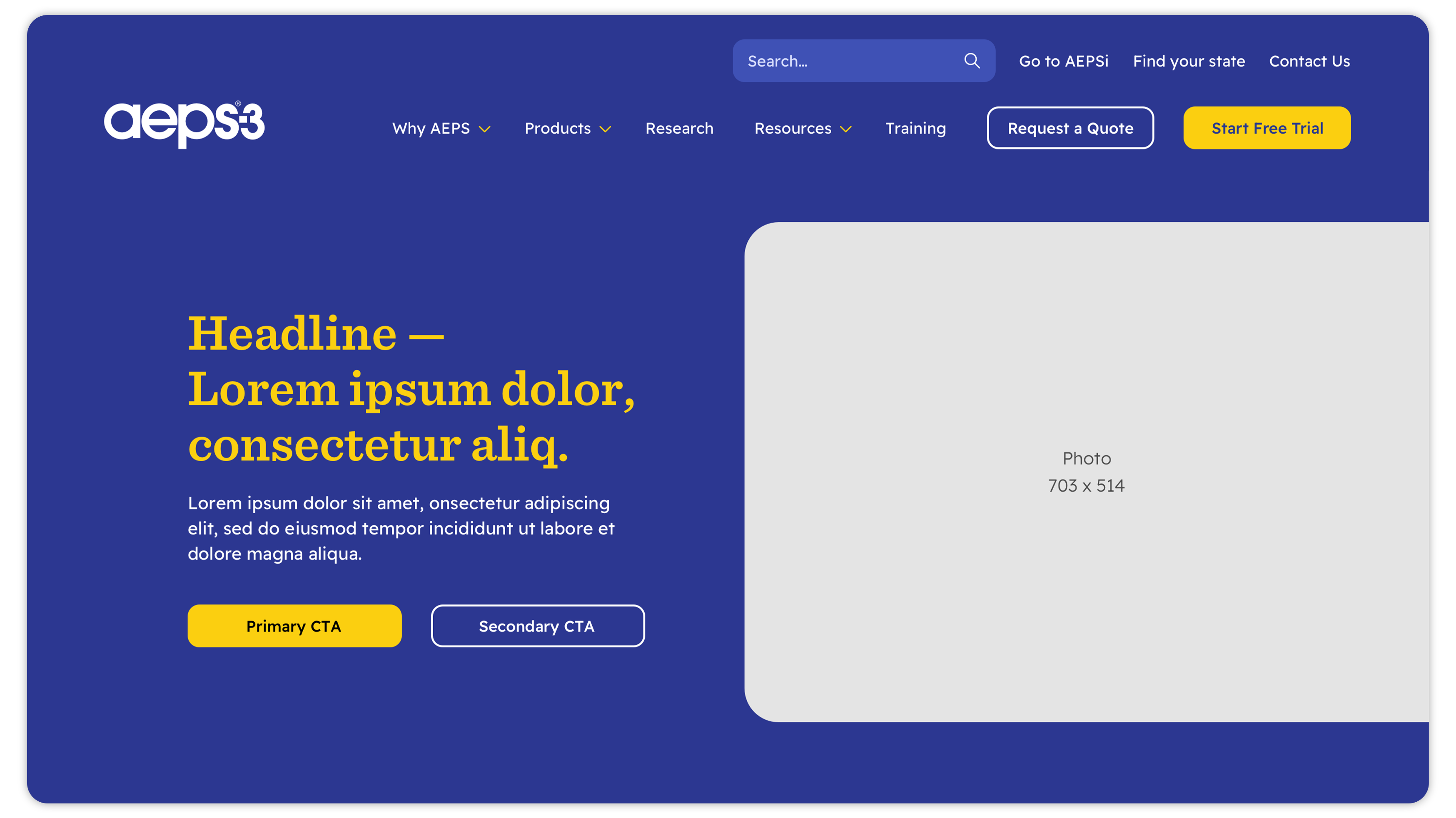
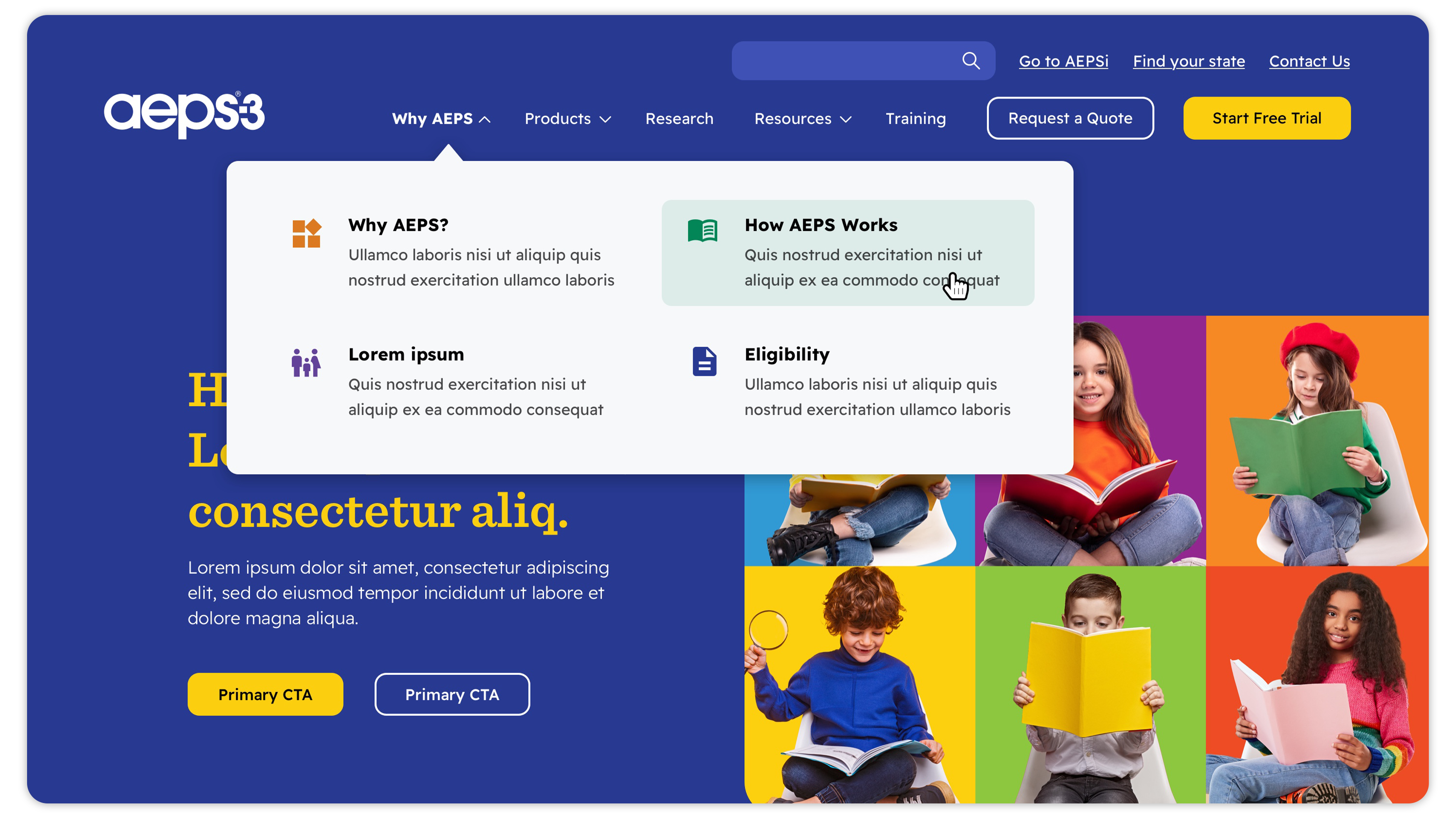
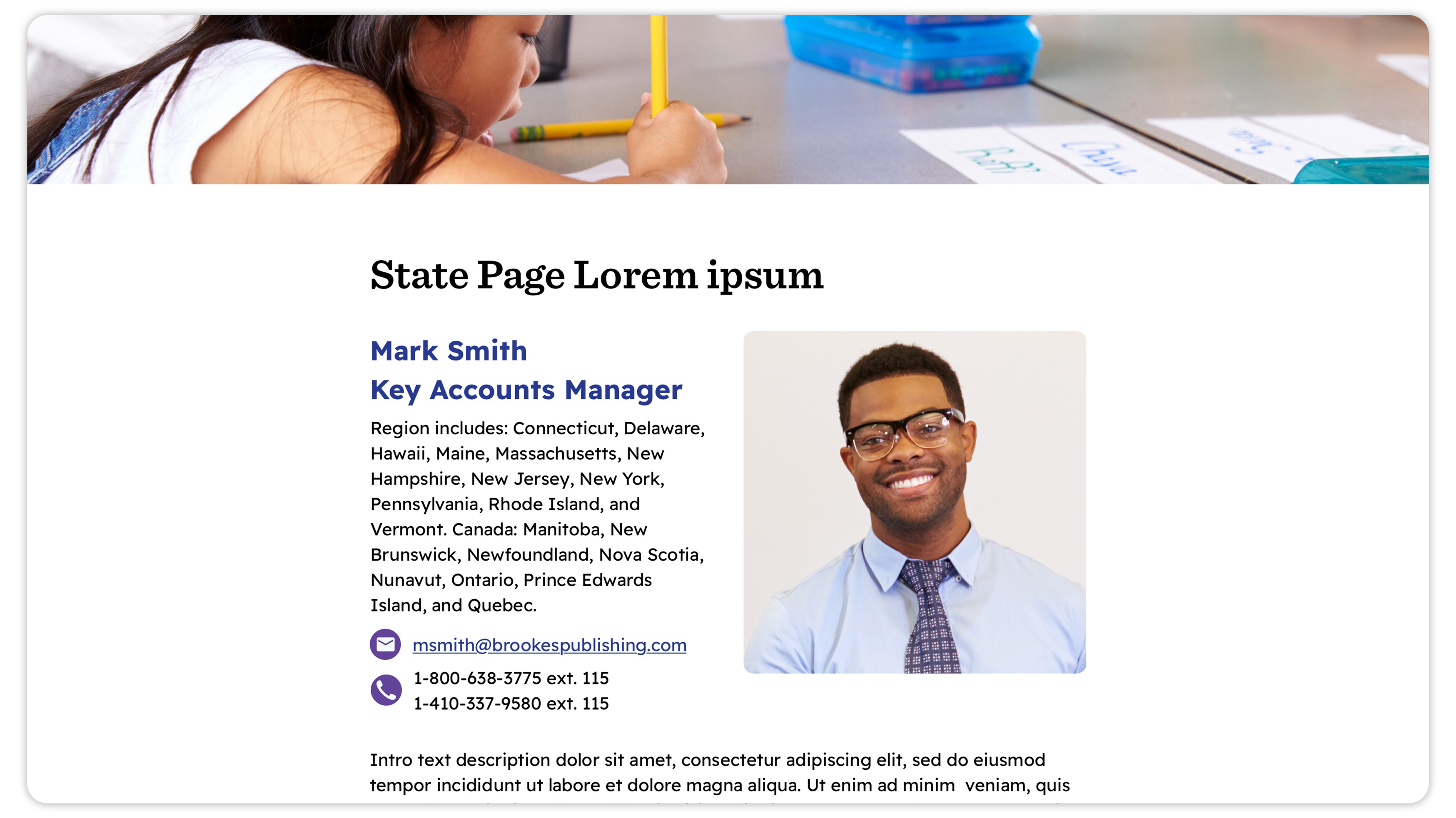
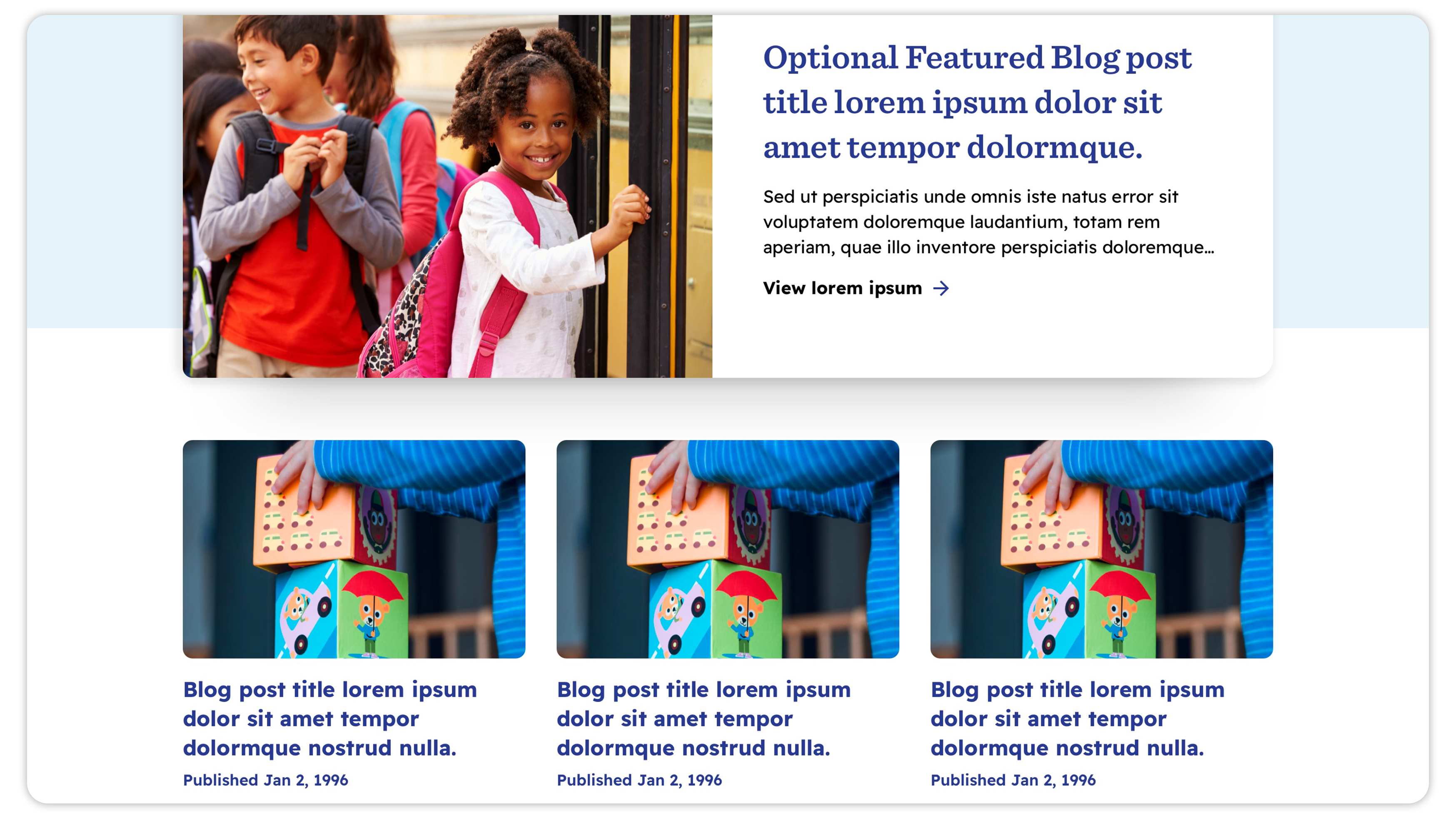
Kids are at the core of AEPS’ mission. We knew that showing them excited about learning, and forming close connections with teachers and family members, would be a key element in our visuals and photography. Leveraging the AEPS’ shared visual language (previously print-only) to create a more colorful, more expressive digital brand, this represents a significant development; a friendly, modern, authorative, and confident step into the digital age.
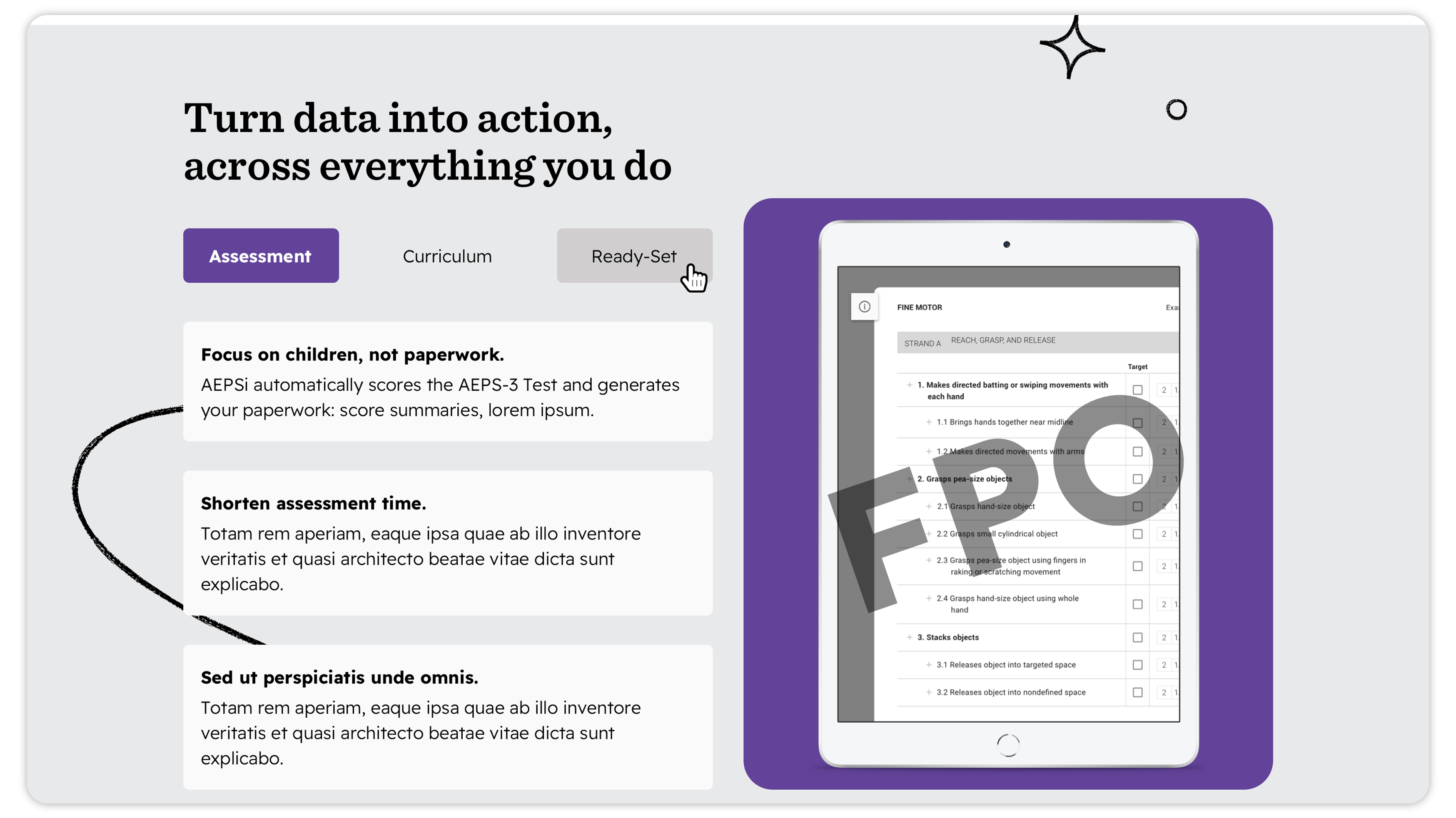
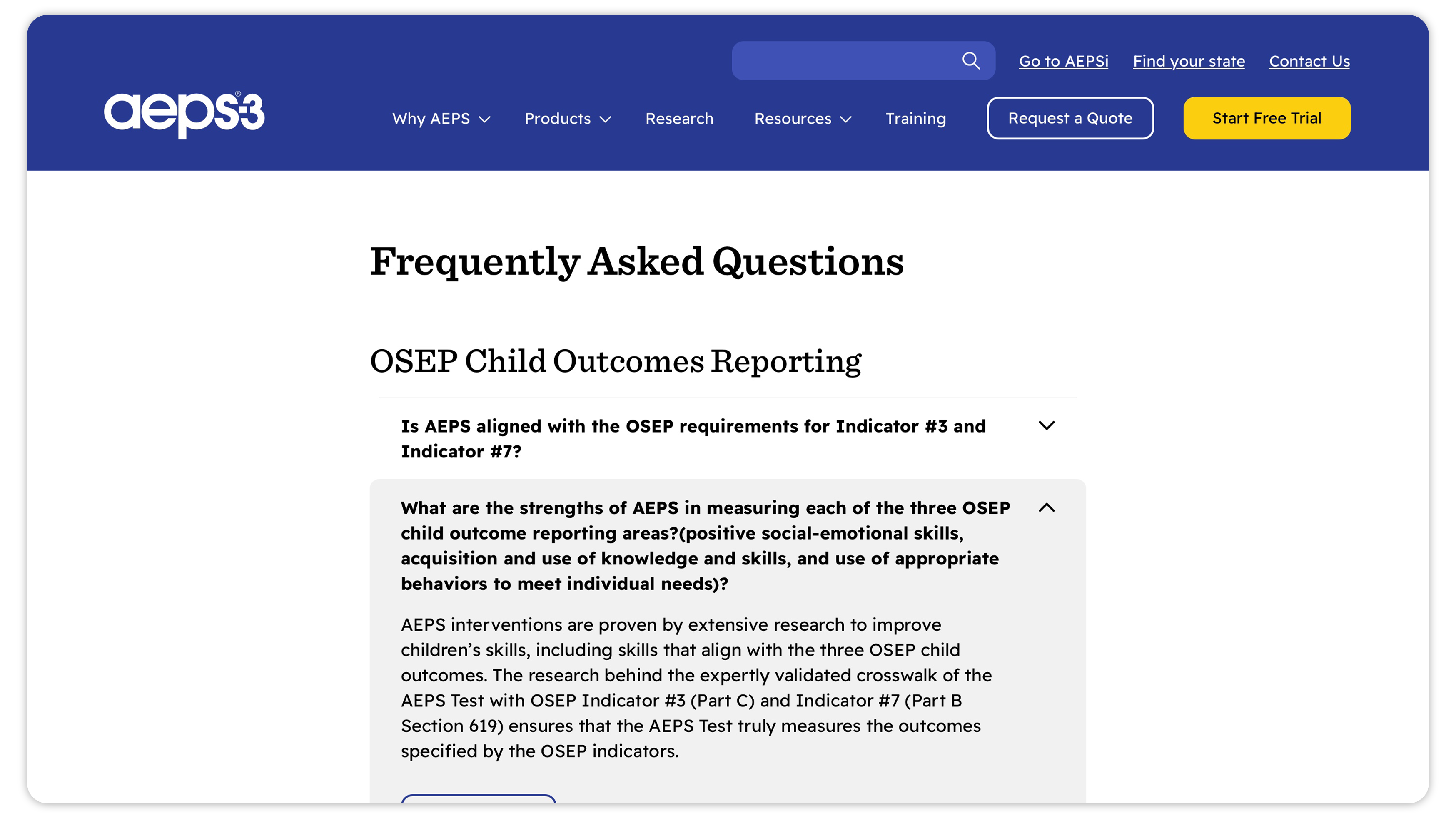
High-Fidelity Screens
User Interviews, Insights & Strategy
The methodology of our discovery process first comprised a review of the old site’s website analytics to identify trends and traffic patterns, as well as interviews with users and stakeholders to gain empathy and uncover critical pain points. We conducted design thinking activities with the AEPS marketing team to understand their collective goals, and finally a heuristic analysis of other complex online products involving management and reporting.
We consolidated our findings in a comprehensive research package, defining key insights, strategies, and tactics to better shape the look and feel of AEPS marketing, and ensure a cohesive brand and excellent user experience.
We consolidated our findings in a comprehensive research package, defining key insights, strategies, and tactics to better shape the look and feel of AEPS marketing, and ensure a cohesive brand and excellent user experience.
UX Sitemap & Select Wireframes
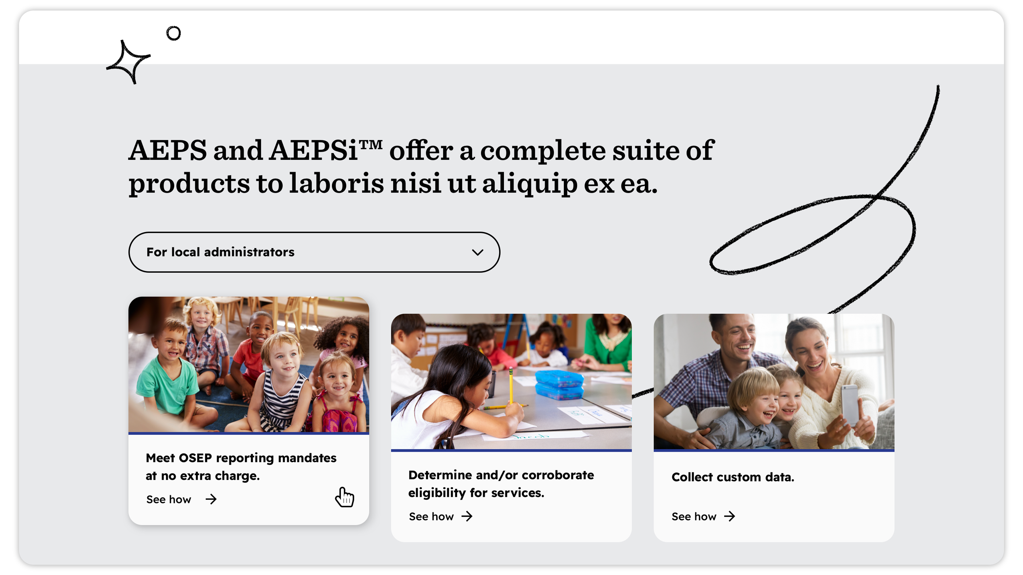
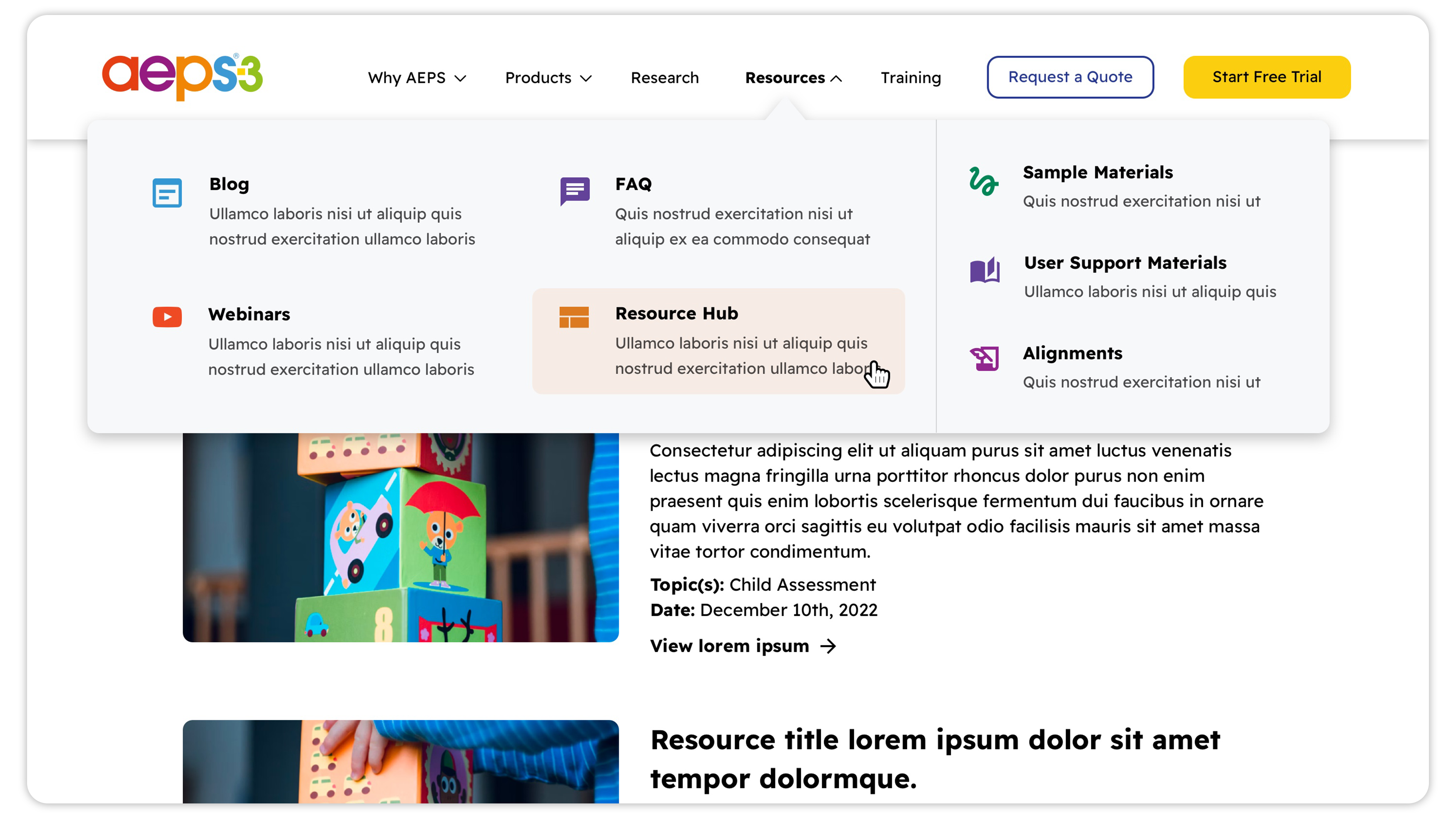
After compiling a full UX sitemap of the current website, we visualized and sorted pages and sections of the site in relation to each other. In creating the information architecture, we were able to cut and consolidate a number of reduntant pages and copy, and streamline the user experience significantly. As our understanding of the navigation deepened, we determined five central categories that together communicated the “who, what, and why” of the AEPS product line, as well as a heavily streamlined additional user hubs and resource archives that would serve longterm marketing efforts. This formed the backbone of our top menu navigation.

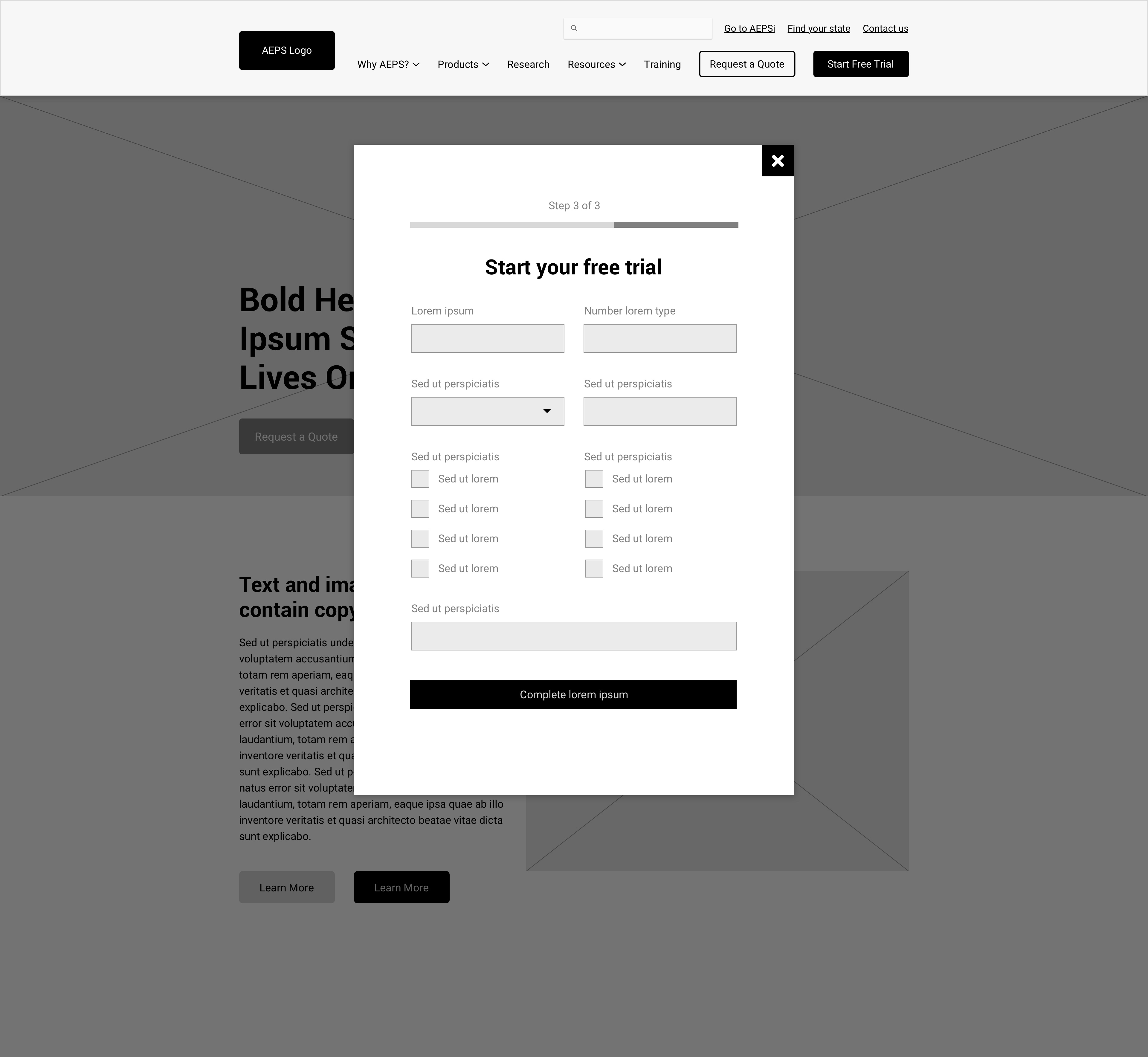
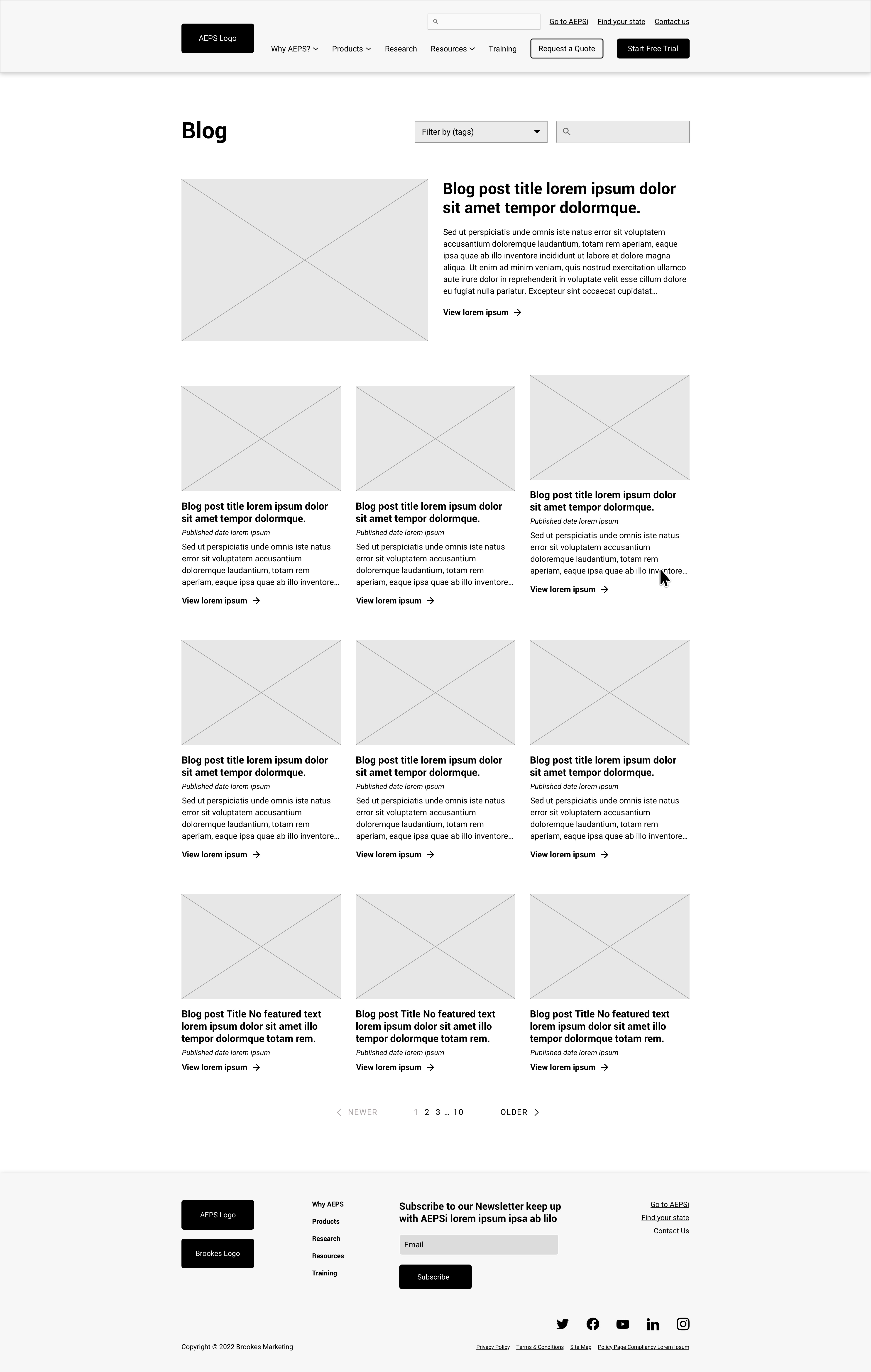
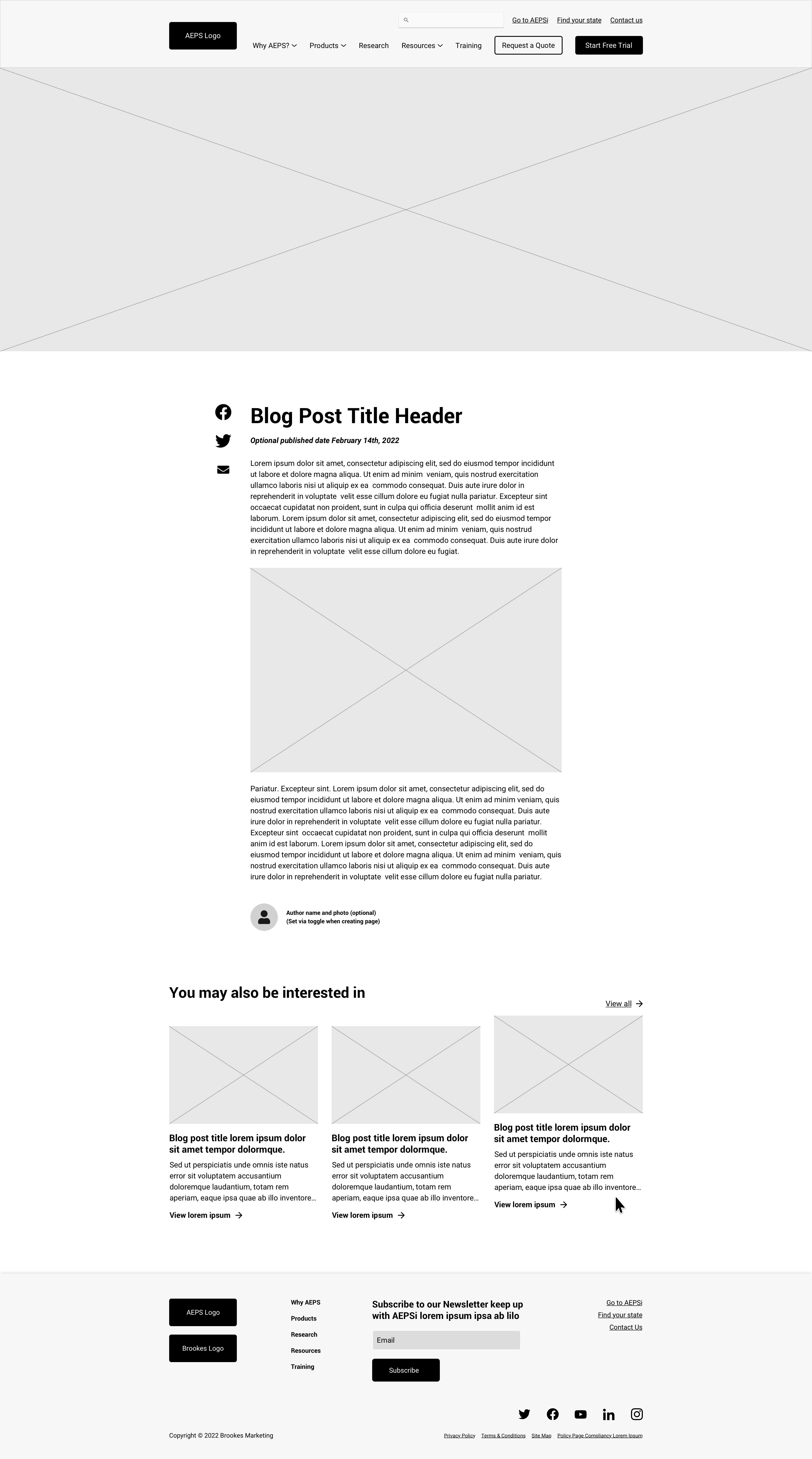
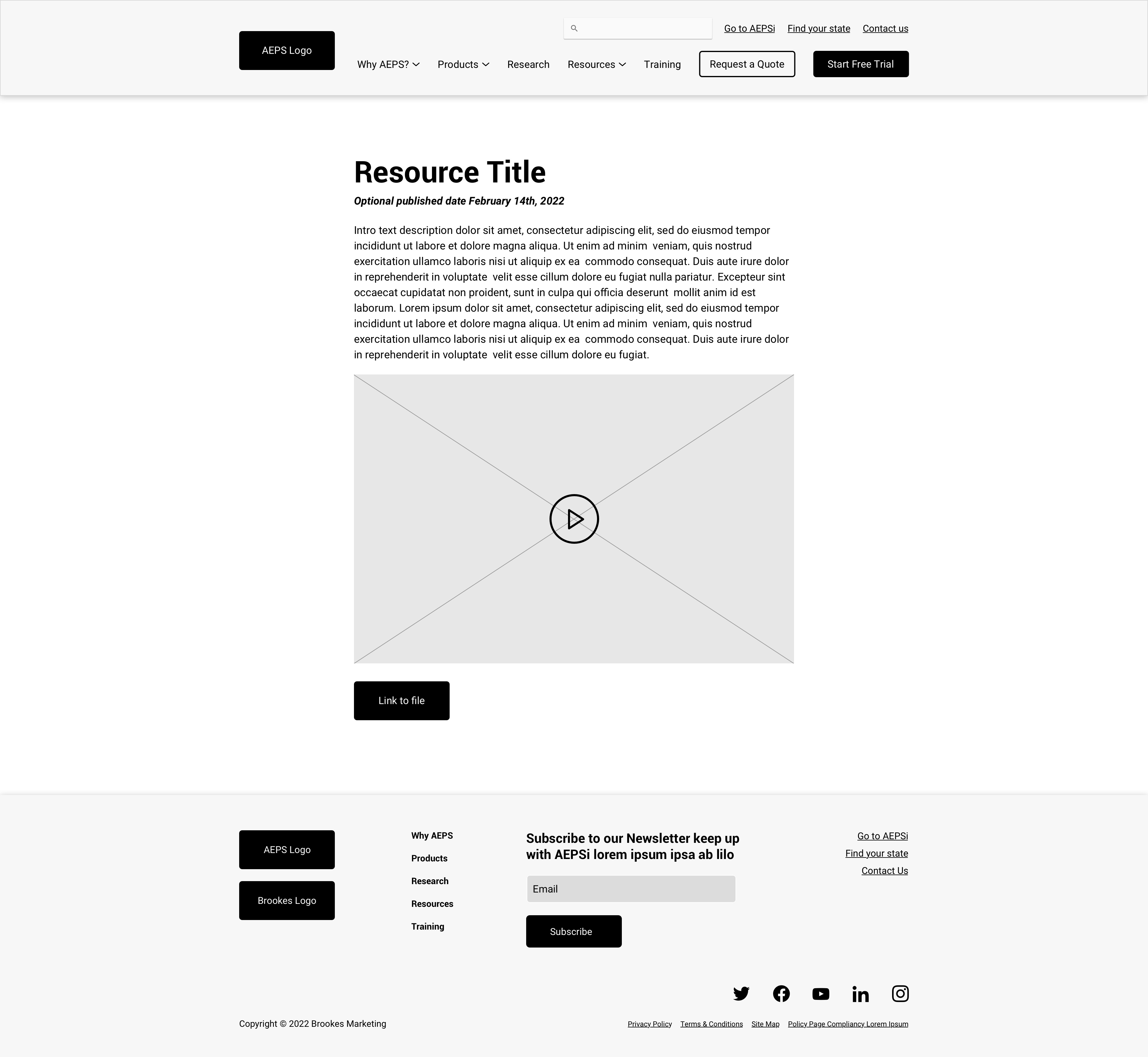
A lean UX approach and guiding principle to keep user decisions easy was one of our key insights, so niche information for AEPS’ complex products was kept under the fold as much as possible. We furthermore additionally developed a simplistic, but elegant, blog section of the site for the marketing team to generate, consolidate (via tags), and share articles and other content for their users. We also established a sleek, user-friendly onboarding for the AEPSi free trial, and integrated forms around the site via Salesforce to collect and communicate user information that is critical to the marketing team.
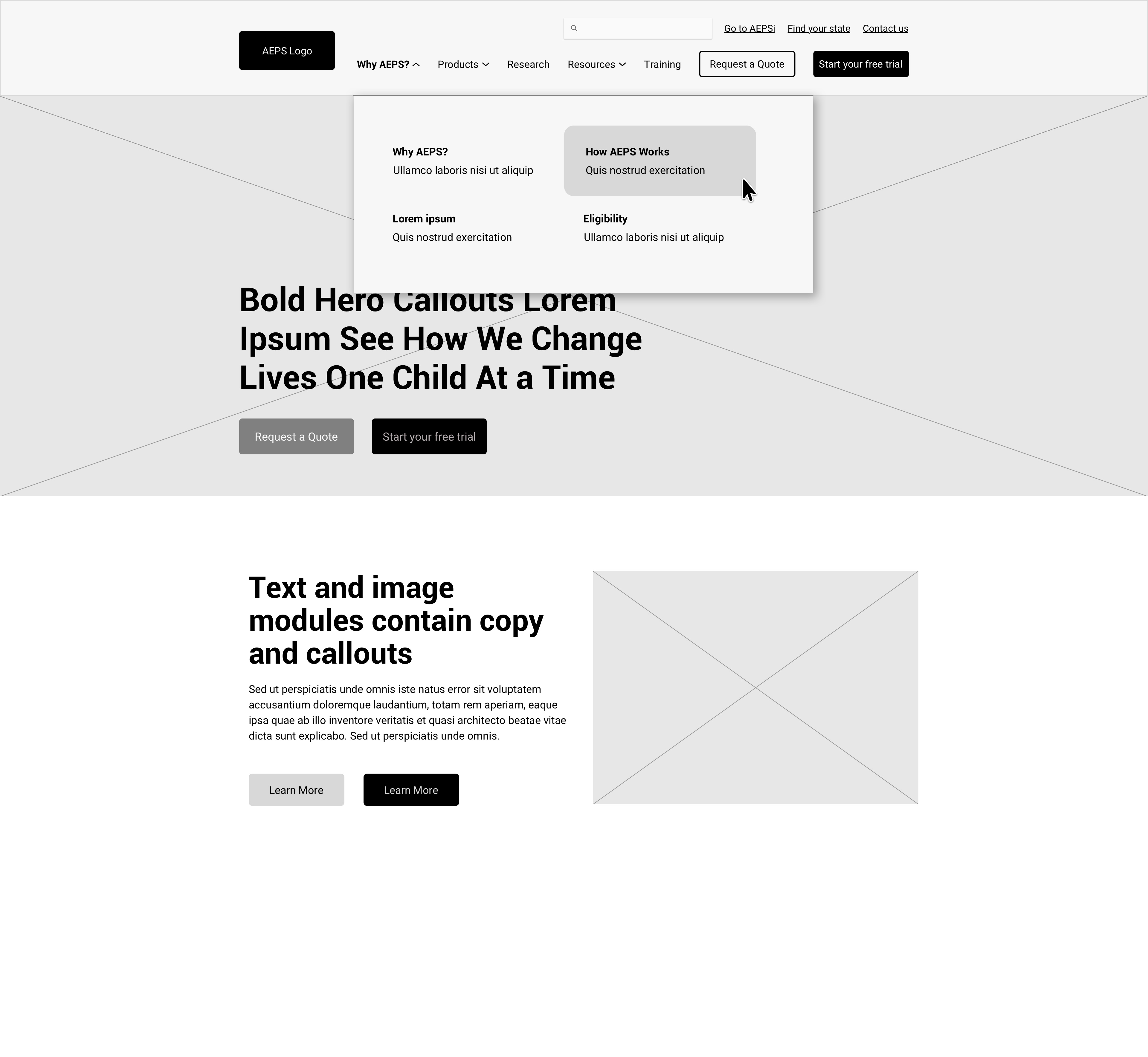
All of these UX and brand features work together to boldly showcase AEPS and AEPSi’s exciting, modern, evolution into the digital space. The site builds upon the trust of their products, the authenticity of their vision, and the vibrancy of their palette and aesthetic. Perhaps best of all, our sleek, simple, user-friendly UX approach allows their marketing team to more easily manage their assets, utilize these new functions as a launchpad for future campaigns, and better form a human connection with users immediately.