Operation Outbreak
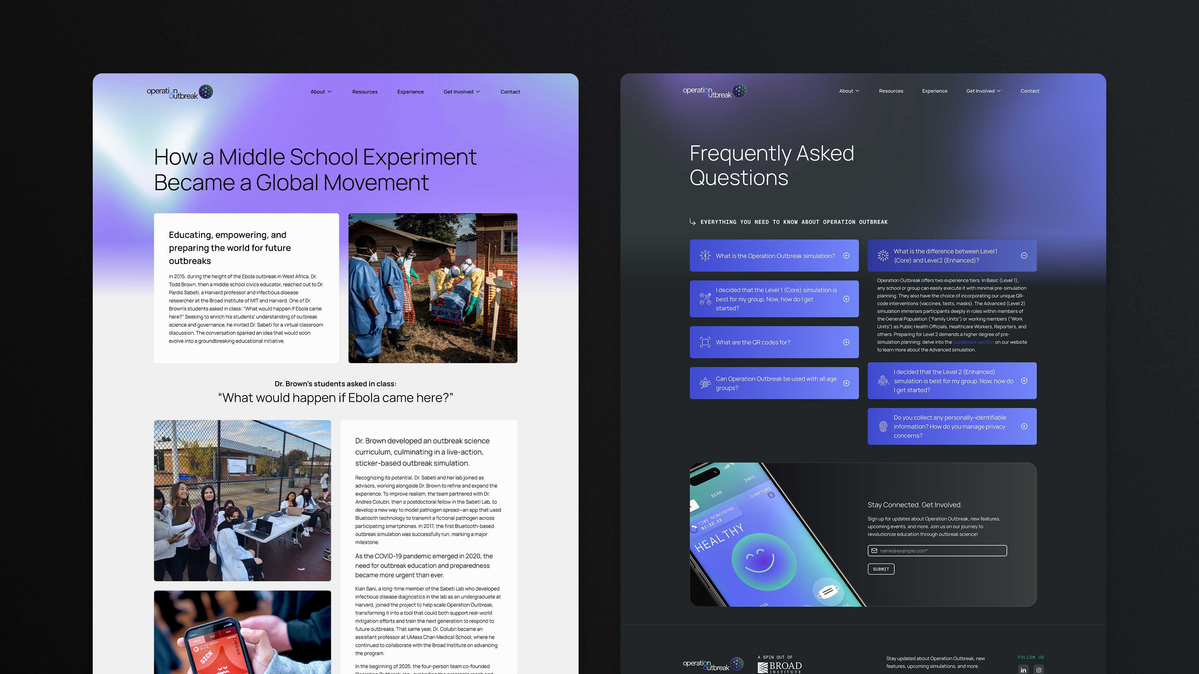
Leading the redesign of Operation Outbreak’s website and mobile app, I helped transform a complex educational platform into an engaging, accessible experience for students and educators.
The Challenge
Operation Outbreak had become a powerful educational platform, but its digital experience hadn’t kept pace. The website and mobile app had grown independently over time, making it difficult for new users to understand the platform, onboard quickly, and fully engage with its capabilities.
Following a broader rebrand, we set out to translate the new identity into a cohesive digital experience; one that felt approachable for students, practical for educators, and flexible enough to support the platform’s continued growth.
As Product Lead, I owned the redesign of both the website and mobile application, working closely with stakeholders and developers from concept through implementation. I led UX strategy, information architecture, interaction design, visual design, and client presentations while continuing to oversee the products as they evolve.
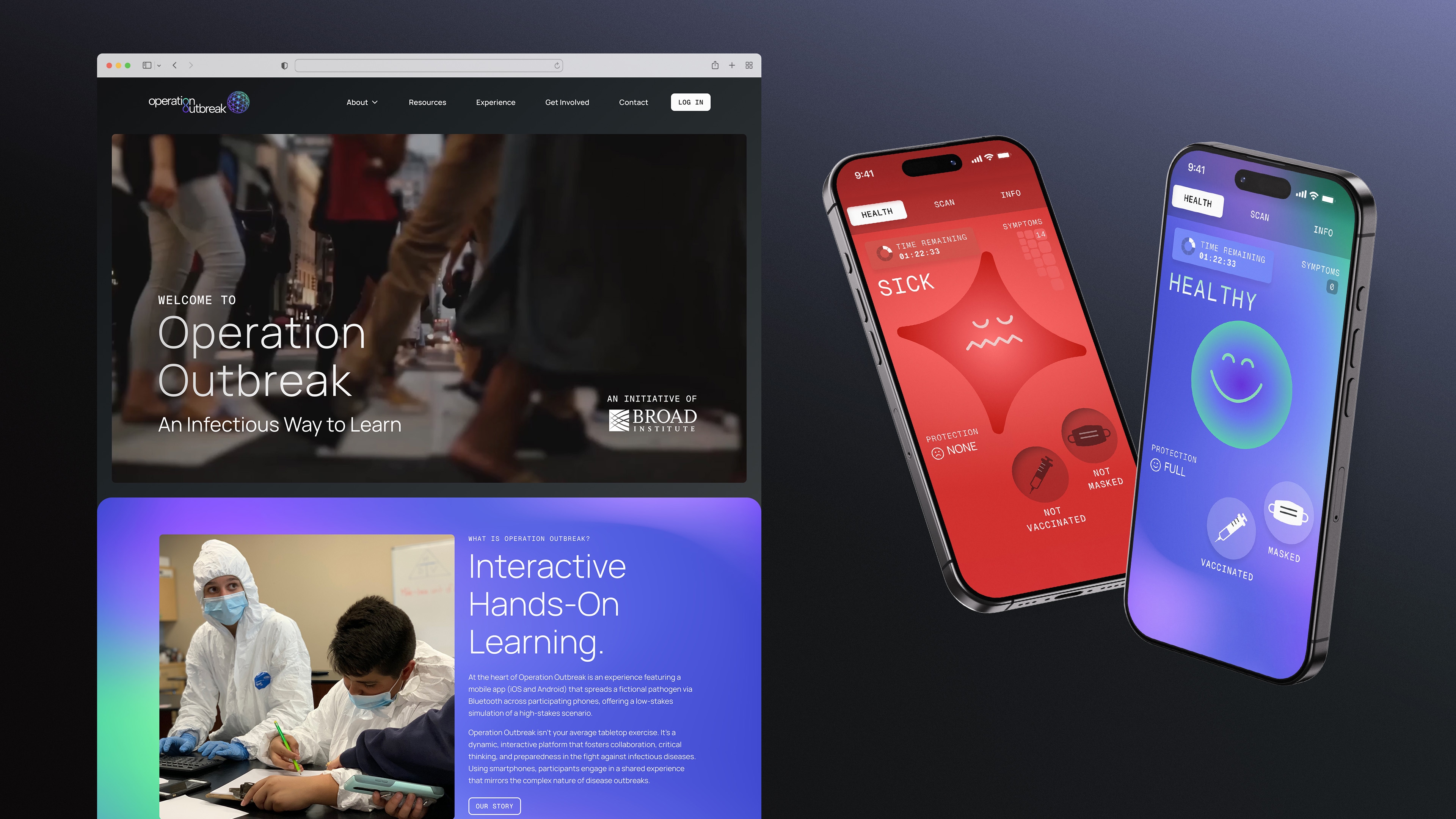
The redesign spanned both the marketing website and the mobile app, giving us an opportunity to rethink how people experience Operation Outbreak from their first visit to their first simulation.
Both products served a different purpose, but they now share common visual language, interaction patterns, and design principles.
The website became the front door: Introducing the platform, communicating its value, and helping educators understand how to get started. The mobile app focused on the simulation itself, streamlining gameplay and making complex epidemiological concepts easier to understand through thoughtful interaction design.
By establishing consistent patterns, navigation, and visual language across both experiences, we created a product that feels cohesive no matter where users begin their journey.
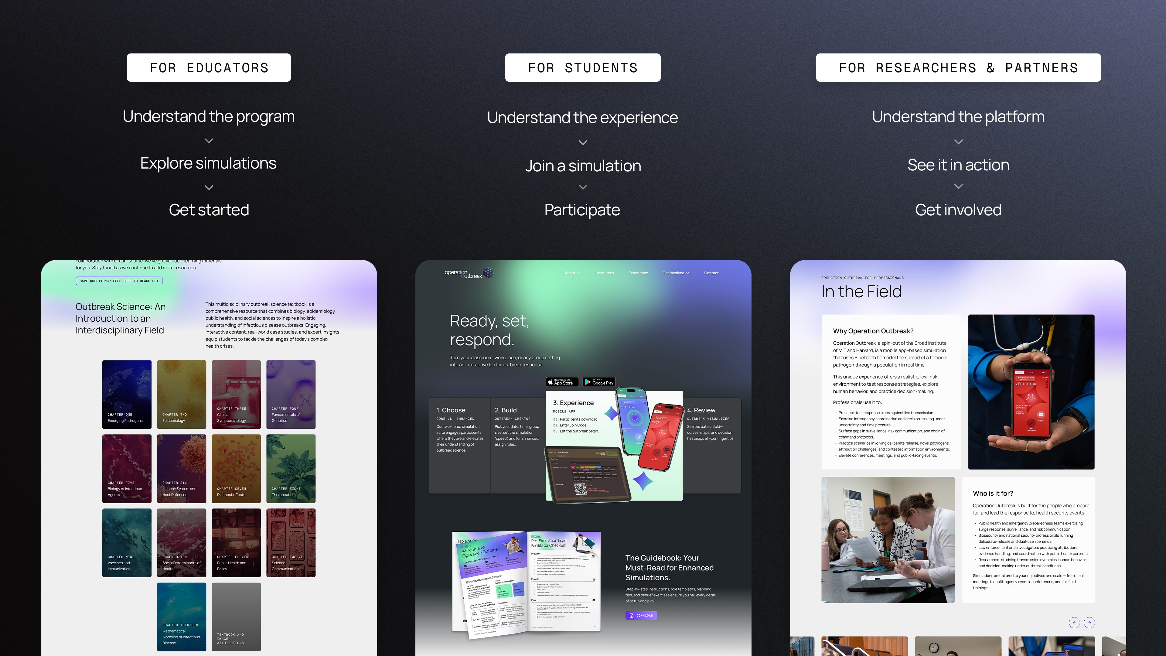
We designed around different starting points.
Operation Outbreak asks a lot of its users. Educators need practical tools for running simulations, while students need an experience that keeps them engaged without getting in the way of learning.
On the website, we organized content around those different needs, creating clearer paths for educators, students, and prospective partners. And within the app, we focused on making the feature-rich experience feel consistent and approachable, using shared patterns and clearer hierarchy to reduce friction.
The website had to be useful.
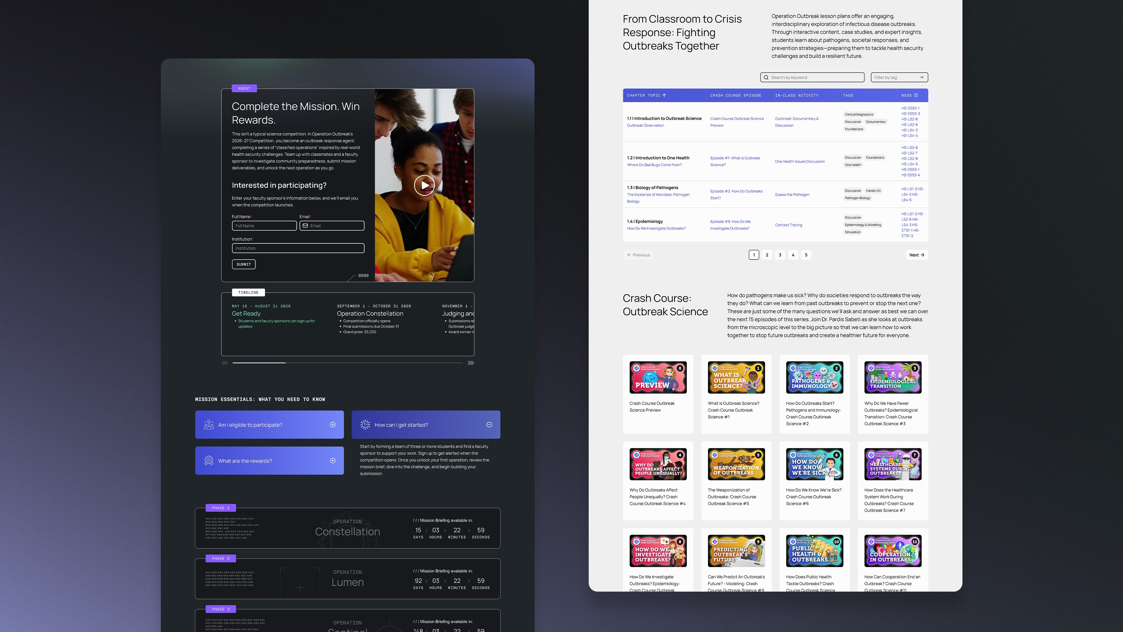
Beyond introducing Operation Outbreak, the website needed to support the people actually using it. We created dedicated experiences for different programs and audiences, while organizing a growing library of educational resources into a structure that educators could easily navigate and use.
The redesign established a foundation that extends well beyond launch.
A flexible design system and scalable UX patterns allow both the website and mobile application to continue evolving as new educational tools, game mechanics, and research initiatives are introduced.
More importantly, the experience better supports Operation Outbreak’s mission. By making the platform easier to understand and more enjoyable to use, the redesign helps educators focus less on explaining the technology, and more on teaching the science behind it.