NJI
A modern redesign of NJI Media’s website, built to showcase the agency’s growing capabilities through thoughtful UX, interactive storytelling, and a flexible design system.
The Challenge
Following a company-wide brand evolution, NJI needed a website that reflected the agency it had become. As the business expanded internationally and its capabilities grew, the existing experience no longer captured the breadth of the work or the level of craft behind it.
As Product Designer, I partnered closely with leadership and developers throughout the project, contributing to UX strategy, information architecture, wireframes, interaction design, and high-fidelity visual design.
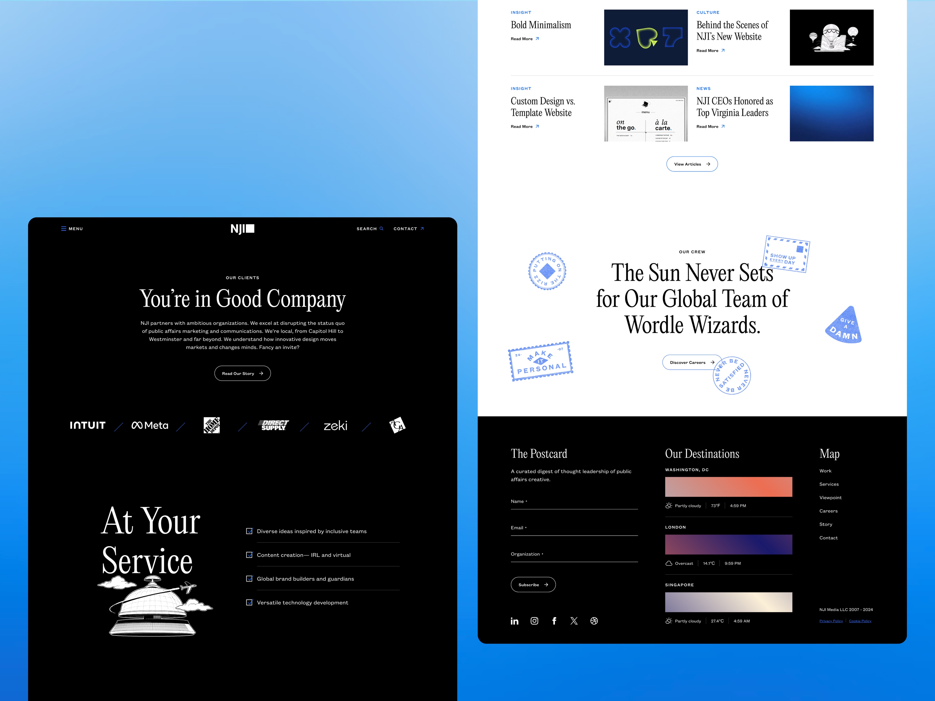
Designing your agency website comes with a unique kind of pressure.
Every interaction, animation, and design decision becomes an example of the work you hope clients will hire you to do. Beyond showcasing projects, the site needed to communicate the agency’s personality, organize a growing body of content, and provide a foundation that could continue evolving long after launch.
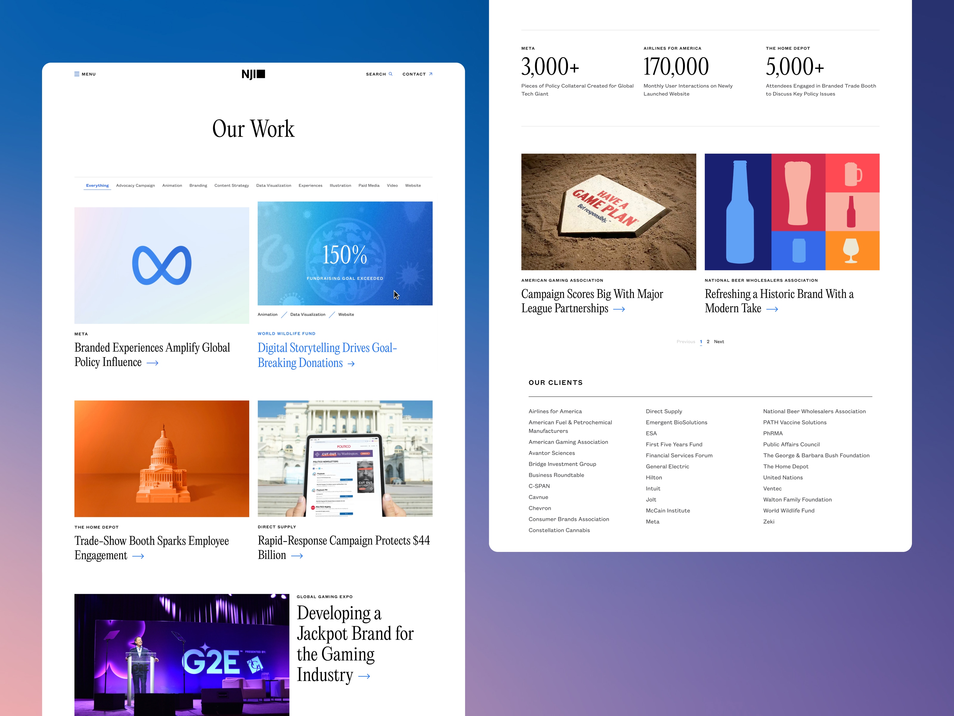
We focused on building a flexible system.
A component-driven design language gave the marketing team the freedom to create new pages while maintaining consistency across the site. Navigation was simplified to make exploration feel more natural, while motion and interaction were used intentionally to reinforce hierarchy, reveal content, and add moments of suprise and delight without competing with the information itself.
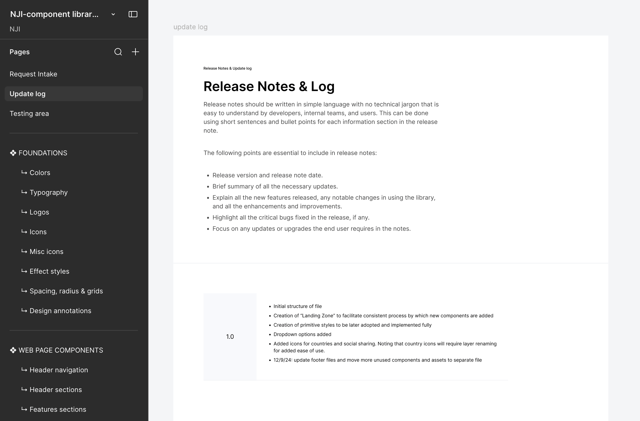
To support future growth, I helped define a reusable component library that established consistent patterns across the site while giving the marketing team the flexibility to quickly build everything from case studies to campaign and proposal landing pages.
Every navigation pattern, content block, call-to-action, and interactive element was designed to be reusable and flexible. This allowed us to maintain a consistent visual language across the site while giving internal teams the freedom to create new content without reinventing the interface.
Throughout the experience, we leaned into the idea of exploration.
One of the biggest UX decisions was organizing content around how prospective clients evaluate an agency rather than how an agency organizes itself internally.
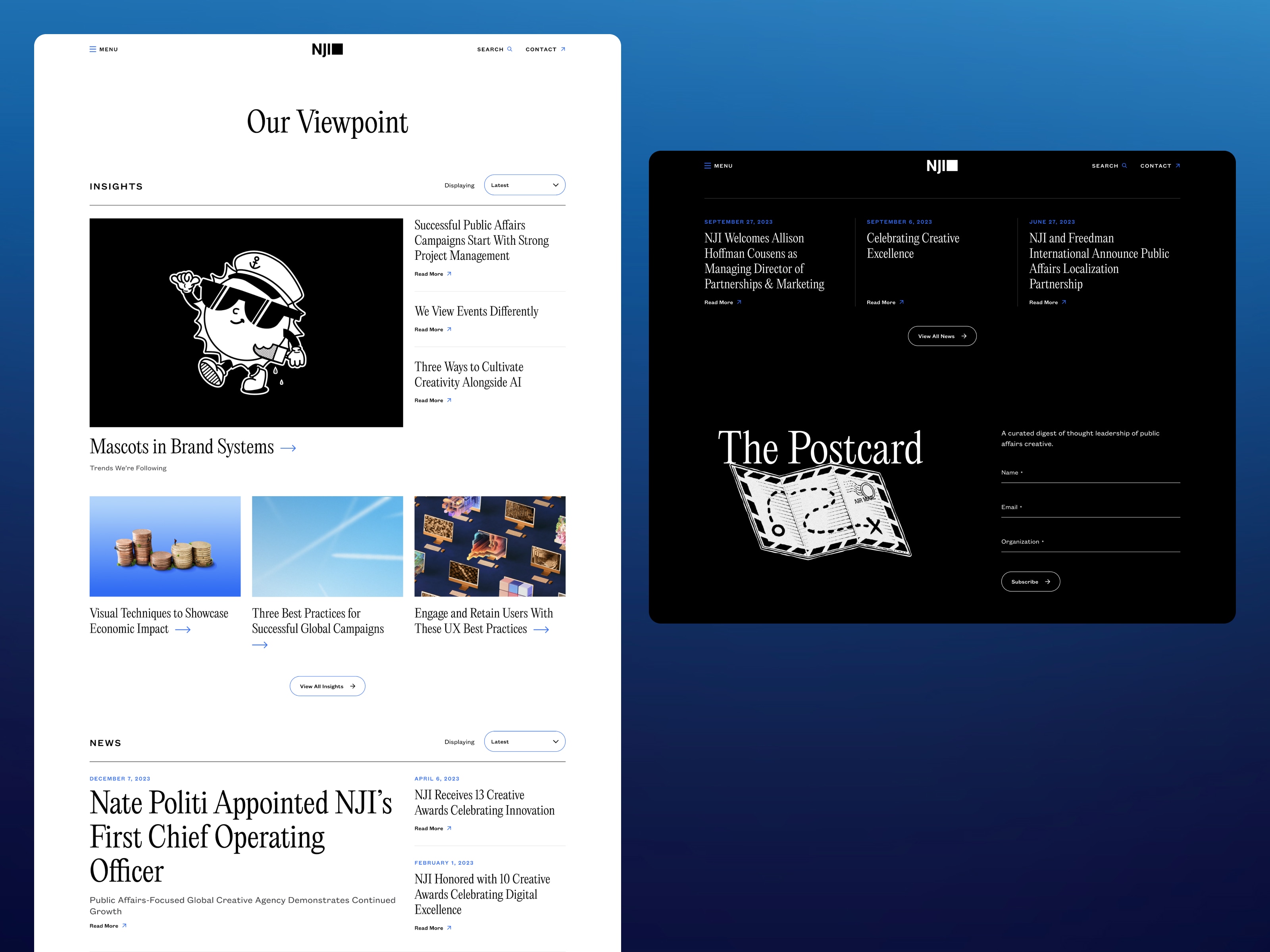
Working closely with leadership and developers, I translated that strategy into a clearer information architecture, creating intuitive pathways into services, industries, case studies, thought leadership, and the people behind the work. Those ideas carried through the visual design, where custom illustrations, subtle motion, and editorial layouts give each story a distinct sense of personality.
Good content needs room to breathe.
Generous spacing, thoughtful typography, and flexible layouts create space for ideas to unfold naturally, giving articles, case studies, and team profiles a consistent rhythm. Whether visitors are discovering the agency for the first time or diving deeper into its work, every page is designed to feel intentional, approachable, and easy to navigate.
Like any good product, it’s designed to grow.
A website for a digital agency is never really finished. (If you know, you know.)
As NJI continues to evolve, the site now has the flexibility to evolve with it. New features can be introduced, content can expand, and the experience can continue improving without sacrificing consistency or craft.